


Data Visualization using Matplotlib library in Python
Graphics and Visuals convey a lot more than raw data.


Matplotlib library in Python
A good, organized pictorial representation of the data makes it easier to understand, observe and analyze.
Matplotlib is an easy-to-use, low-level data visualization library that is built on NumPy arrays. It consists of various plots like scatter plots, line plots, histograms, etc.
To install this type the below command in the terminal.
pip install matplotlib
Pyplot is a subpackage used to build plots.
import matplotlib.pyplot as plt
Bar Graph
- A bar chart uses bars to show comparisons between categories of data.
plt.bar(x_component,y_component)
Scatter plot
- A scatter plot is for any relationship pattern between two quantitative variables.
plt.scatter(x_axis,y_axis)
Line Graph
- A line graph is used to track variations over time.
plt.plot(x_axis, y_axis)
Adding Titles and Labels
plt.xlabel( ), plt.ylabel( ) are used to specify labels for x axis and yaxis.
plt.title( ) is used to add title to the plot.
plt.show( ) is the command required to display the plot object.
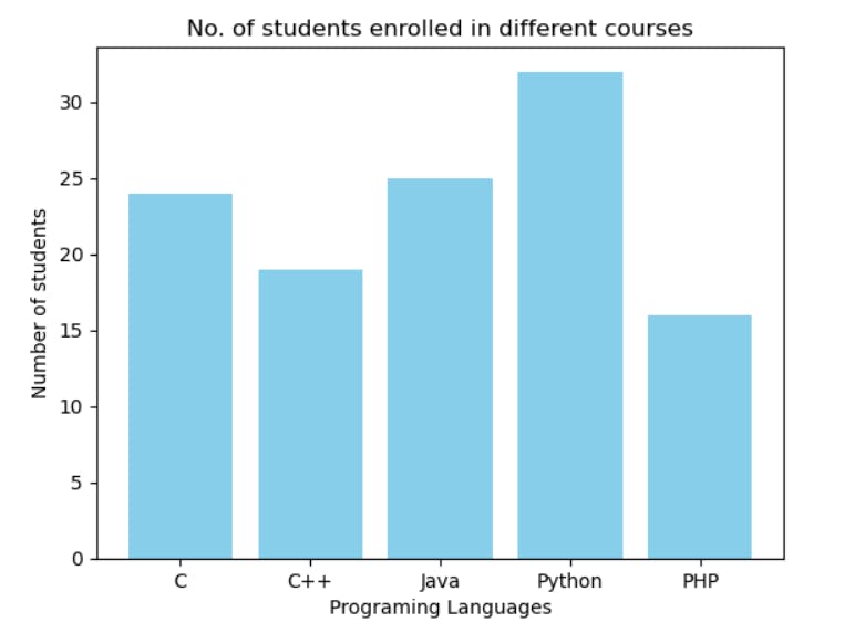
Here is an example of a bar plot. It consists of number of students enrolled in different courses offered at an institute.
import matplotlib.pyplot as plt

langs = ['C', 'C++', 'Java', 'Python', 'PHP']
students = [24,19,25,32,16]

plt.bar(langs,students ,color = 'skyblue')

plt.xlabel('Programing Languages')
plt.ylabel('Number of students')
plt.title("No. of students enrolled in different courses")

plt.show()
Hope this article finds you well. For more insights, click here.
Feel free to share your thoughts in the comment section down below. You can connect with me on Linkedin as well. Thanks for reading:)